Retail is rapidly transforming. Consumers expect an omni-channel experience that empowers them to shop from anywhere in the world. To capture this global demand, retailers have developed ecommerce platforms to complement their traditional brick-and-mortar stores. Ecommerce is truly revolutionizing the way retailers can collect data about the customer journey and identify key buying behaviors.
As described by Beyond Marketing by Deloitte, analysts are taking advantage of “greater volumes of diverse data—in an environment that a company controls—mak[ing] it possible to develop a deeper understanding of customers and individual preferences and behaviors.” Savvy retailers will leverage the influx of data to generate insights on how to further innovate products to the tastes and preferences of their target audience. But how can they do this?
Try a Data Warehouse to Improve Your Analytics Capabilities
Retailers are looking to leverage data to find innovative answers to their questions. While analysts are looking for those data insights, leadership want immediate insights delivered in a clear and concise dashboard to understand the business. Oracle Autonomous Database delivers analytical insights allowing retail analysts to immediately visualize their global operations on the fly with no specialized skills. In this blog, we’ll be creating sales dashboards for a global retailer to help them better understand and guide the business with data.
Analyzing Retail Dashboards
Retail analysts can create dashboards to track KPIs including: Sales, Inventory turnover, Return rates, Cost of customer acquisition, and Retention. These dashboards can help with monitoring KPIs with easily understandable graphics that can be shared with executive management to drive business decisions.
In this blog, we focus on retail dashboards that break down sales and revenue by:
◉ Product
◉ Region
◉ Customer segment
Read More: 1Z0-432: Oracle Real Application Clusters 12c Essentials
In each dashboard, we will identify and isolate areas of interest. With the introduction of more data, you can continuously update the dashboard and create data-driven insights to guide the business.
Understanding the Retail Data Set
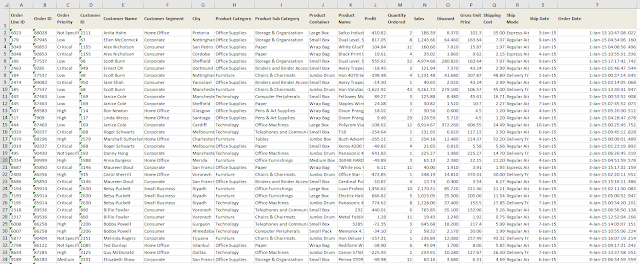
We used modified sales and profit data from a global retailer to simulate the data that retail analysts can incorporate into their own sales dashboards. In our Sample Order Lines excel (shown below), we track data elements such as: Order ID, Customer ID, Customer Segment, Product Category, Order Discount, Profit, and Order Tracking.
Data Visualization Desktop, a tool that comes free with ADW, allows users to continuously update their dashboards by easily uploading each month’s sales data. By introducing more data, we can understand how the business is changing over time and adapt accordingly.
We looked at the following questions:
1. What is the current overview of sales and profit broken down by product?
2. Which regional offices have the best sales performance?
3. Which geographic regions are hotbeds of activity?
4. How are different products and regions linked together by sales?
5. Which market segments are the most profitable?
6. Which specific products are driving profitability?
Here is the view of the data in Excel:
Here’s a quick snapshot of the data loaded into Data Visualization Desktop:
What is the current overview of sales and profit broken down by product?

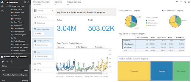
This is a sales dashboard summary which shows the overall revenue and profit from different product segments. Here are some quick insights:
◉ Using tiles (top left), we see: $1.3M profit out of $8.5M total sales making a 15.3% profit margin.
◉ We use pie charts to break out total sales and profit by product category (top right). Technology products not only contribute the most to sales of any single product category (40.88%) but also make up the most profit of any single category (56.15%), meaning that technology products are the highest grossing product line. Under the pie charts is a pivot table showing the actual figures.
◉ A line graph shows that every product category has been growing with technology products growing the fastest (bottom left). There was a spike in technology sales that started August and peaked in November 2018.
◉ Sales are broken down by both product and customer segment so that we can understand more about the buying habits for different customers (bottom right).
For an even more detailed segment analysis, we also broke out the corporate customer segment (below) to compare with the overall business (above).
Which regional offices have the best sales performance?
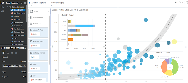
In this visualization, we’re looking at the performance of different regional offices and how they’re collectively trending. We overlaid a horizontal stacked graph and a donut chart on a scatterplot. Using a dot to represent each city, the scatterplot analysis compares profit (x-axis) vs sales (y-axis) using larger dots to represent larger customer populations in each city.
For example, the dot in yellow (far right) represents San Paulo, Brazil with 127 customers generating $200,193 in sales and $44,169 in profit. As the most profitable city, San Paulo has a profit margin of 22%, averaging total purchases of $1,576 per customer. On the scatterplot, cities that make at least $10,000 of profit are indicated left of the dotted line.
The horizontal stacked graph (top left) breaks down sales by continent so you can see which regions are leading in sales. The donut chart (bottom right) indicates shows the total amount of sales from all the regions ($9M) and shows each region as a percent. Here are the leading regions by sales:
◉ America (38.64%)
◉ Europe (28.81%)
◉ Asia (18.05%)
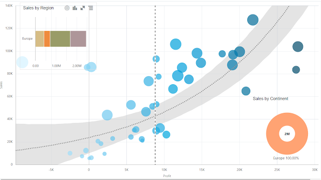
To learn more, we use the “keep selected” option to dynamically look at a specific region like Europe (shown below). We can see that Europe accounts for just under $2.5M in sales with the largest portion coming from Northern Europe. The scatterplot also dynamically changes to only show cities in Europe. Now you can now identify that the profitable European city is Belfast, Northern Ireland ($27,729) and the city with the most sales is St. Petersburg, Russia ($127,521). This allows us to identify and replicate the success of the offices like Belfast and St. Petersburg in the other regions as well.
Which geographic regions are hotbeds of activity?
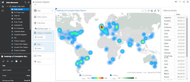
Analysts need to identify which markets to immediately focus on. Using a heat map, we can see which regions have the most sales (shown in color) and regions without sales (gray). This particular global retailer’s sales are primarily in developed markets:
1. America ($1.5M+)
2. United Kingdom ($887K)
3. Australia ($695K)
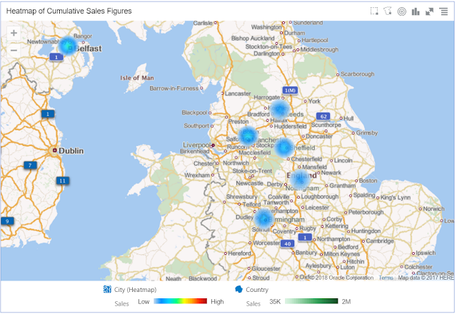
We can investigate further to pinpoint the exact cities (below) in the UK. We can see that the sales are originating from multiple cities including:
◉ Belfast
◉ Leeds
◉ Manchester
◉ Sheffield
Using a heat map can not only help identify how easily customers access storefront locations but also show where to expand operations based on demand.
How are different products and regions linked together by sales?
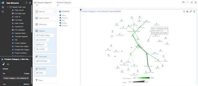
It’s often hard to see how different factors like sales, product, and geography are interrelated. Using a network map, we see how products categories (technology, furniture, office supplies) are linked to continents that are sublinked to countries. The thickness of the connecting line from one node on the network to another is based on sales and the deeper shades of green are represent more profits. We hover over the line connecting Africa to Southern Africa (above) to see the total sales ($242K) and profit ($34K) from Southern Africa.
Another way to focus on a specific region is to hover over a specific node and use the “keep selected” option (below). In this in the example, we only identify nodes linked to Europe. By doing this, we can see that a majority of the sales and profits from Europe are coming from technology products ($1,030K sales, $213K profit) and originating from the Northern Europe ($974K sales, $162K profit) specifically the UK ($880K sales, $162K profit). Analysts can identify the regional sources of sales/profit while seeing a macroview of how products and regions are linked.

Which market segments are the most profitable?
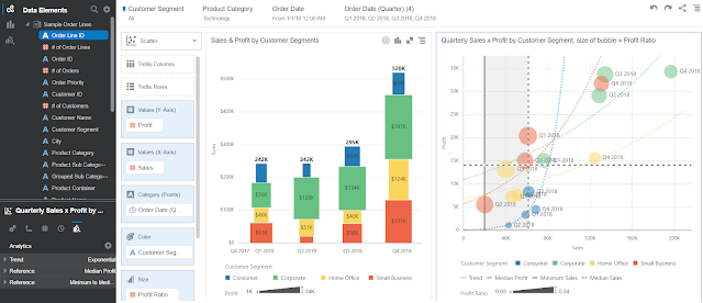
It’s critical to understand which customer groups are growing the fastest and generating the most sales and profit. We use a stacked bar (left) and scatterplot (right) break down profitability by market segment in FY18. We categorize buyer types into:
◉ Consumer
◉ Corporate
◉ Home office
◉ Small business
In the stack bar, we can see that the sales has been growing from Q2 to Q4 but the primary market segments driving sales growth are corporate (61% growth since Q1) and small business (53% growth since Q1). The combined growth of the corporate and small business segments lead to a $191K increase of sales of since Q1. Although these two segment made up over 63% of total sales in FY18Q4, we can also see that sales from the home office segment more than doubled from FY18Q3 to FY18Q4.
In a scatterplot (right), we can see the changes in profit ratio of each market segment over time. The profit ratio formula divides net profits for a reporting period by net sales for the same period. The fastest growing market segments and the most profitable market segments in FY18 (top right quadrant) are:
◉ Corporate
◉ Small business
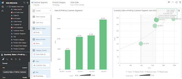
We can also isolate the profitability of the corporate customer segment (below). By generating insights about the target market segments, companies are able to focus their product development and marketing efforts.
Which specific products are driving profitability?

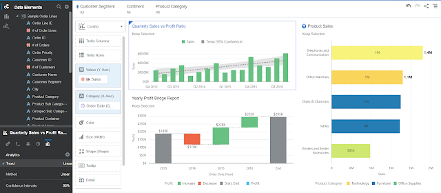
Retailers are often managing a portfolio of hundreds, if not thousands, of products. This complexity makes it challenging to track and identify the profitability of individual products. However, we can easily visualize how profitability has changed over time and compare it to specific products. We use a combo graph (top left) to indicate changes to sales and profit ratios over time.
Generally, we can see that every year sales (and profits) increase from Q1 to Q4 then drop off with the start of the next Q1. We use a waterfall graph to track how profits have gradually changed over time (bottom left). From 2013 to the end of 2018, there was a net gain of $167K in profit.
Analysts identify performant products to expand and unprofitable products to cut. On the right, we track sales and profit ratios by individual products. We can see that product that generate the most sales are:
1. Telephones/communication tools ($1,380K)
2. Office machines ($1,077)
3. Chairs ($1,046K)
The products with the highest profit ratio are:
1. Binders (35 percent)
2. Envelopes (32.4 percent)
3. Labels (31.6 percent)
This means that for every binder sold, 35 percent of the sale was pure profit. We also found that product such as bookcases (-5.2 percent), tablets (-5.3 percent), and scissors/rulers (-8.3 percent) had negative profit ratios, which means that there was a loss on each sale. We can also isolate sales performance of the top five products (below).
Source: oracle.com




0 comments:
Post a Comment