This article describes how you can use an Oracle Analytics Cloud (OAC) workbook to analyze trends and shifts in payroll, worked hours, and self-identified health rates for restaurant industry employees based on their roles. By using these insights, managers can identify gaps and can adjust their decisions according to industry statistics and payroll standards. The workbook includes an image map, KPI tiles, and horizontal bar graphs to visualize trends and insights within the dataset and the custom background. Note that the data in this workbook is for demonstration purposes only.
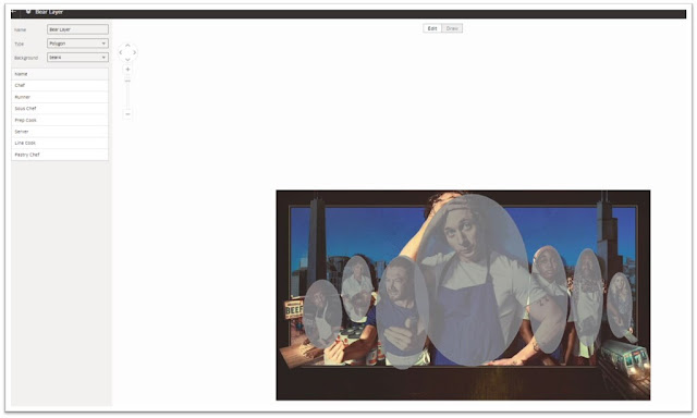
To begin, open a workbook in OAC. To use an image as a map, click the hamburger menu on the top-left corner of the page and select Console, then select Maps. Under Image Background, click the plus sign to add an image, or drag and drop the image to be used as a background. Once the image is available in the list, click the option icon (indicated by 3 dots) and select Create Map Layer to open the image as a map layer, then create polygons, lines, or points. Polygons are used in this workbook as shown in the following image.
In your dataset, assign a column to the polygons. For this image, each character in the picture represents a role at a restaurant, so the Role column from the dataset is assigned to this map. Select the respective column and from the options menu, select Location Details to select a map layer and see the match quality between your data column and the map layer polygons.
Now you can include the map layer in the workbook. Before starting to create visualizations, create custom calculations by right-clicking My Calculations, then Add Calculations. Calculations required for this workbook include salary change, health rate, and work hours change in 2021 from 2020.
To use the image map layer, drag the role and required metrics onto the visualization window to be shown in the image. Add the appropriate metrics in the tooltips section. When users hover over the image map, they can see the metrics for each role. To make the polygons transparent, set the transparency to 100 in the grammar menu.
To visualize the average annual salary, total worked hours, and salary per hour for each year, use a tile visualization to present each of these KPIs.
Use horizontal bar charts to present the changes in annual salary, worked hours, and health rates between 2020 and 2021 using the custom calculations. For the Annual Change in Work Hours visualization, add a reference line to show the median change and to help with comparisons. Right-click the chart and from the menu, select Add Statistics and Reference Line. In the grammar menu on the left pane, change the function to average, median, or other appropriate values.
To match the workbook colors with the image map, use a custom dark background image. At the bottom of the workbook, click Canvas Properties, select Custom for background, and select the desired background color. The folloiwng image shows the workbook using a dark background color from the Fill Color section and an uploaded background image.
Use custom colors for bar charts by right-clicking the chart, selecting the colors, and assigning a custom color to each metric.
Lastly, use text boxes for the workbook’s header and footer.
This has been a quick tour through creating a fun, eye-catching workbook that helps restaurant managers understand employee activity, which in turn helps them better support and manage their staff.
Source: oracle.com


0 comments:
Post a Comment