The birth of an idea
In September 2020, COVID-19 was spreading fast and was extremely dangerous, with people globally afraid of becoming infected. Before vaccinations became available, avoiding exposure was the only way to keep safe and minimize the spread.
In Finland, a group of passionate volunteers made it their mission to collect all available exposure data in a blog and report it on Twitter. Although the blog was a great asset to the public, maintaining it became very time-consuming. Data needed to be copied into Microsoft Excel spreadsheets for further analysis, and the volunteers needed to create new charts and reports continually.
As the number of exposures in Finland grew, the amount of work became too much for the volunteers to manage. To find a solution, one of the volunteers reached out to me, asking for help finding a better way to manage and analyze the data. The only other requirement for the new solution was that it needed to be free, because the group of volunteers had no money.
Based on my experience in data analysis and the available technologies in that space, I came to the conclusion that Oracle’s database technologies would be the right choice for the task. Oracle provides these technologies entirely for free in the Oracle Cloud Always Free Tier, making it perfect fit for what the group needed. Oracle Cloud Free Tier includes Oracle Autonomous Database as a fully managed cloud database service that includes Oracle Application Express (APEX), a low-code development environment for building web-based, data-driven applications fast. In addition, Oracle APEX makes it possible to easily visualize data as charts and graphs. All of this meant that no funding was needed for licenses, nor did the volunteers need people to maintain the hardware, backups, upgrades, and so forth but instead could focus on building and maintaining the application.
Once the technology stack was clear, I approached my colleagues from Miracle Finland to help build the application.
The creation of an autonomous app
Everybody was excited about the project: It gave them the chance to work for a good cause, using tools they liked and would have a chance to learn more about during the process. Within one day, the team set up a cloud environment with the Oracle Autonomous Transaction Processing database service and its built-in Oracle APEX. There was no need to spend any time with installations or configuration, so we could focus on the application right away.
The first step was to load the data from Excel spreadsheets into the Oracle Autonomous Transaction Processing database. This was easy, thanks to the drag-and drop functionality of the Oracle APEX Data Workshop feature. Then, using the Oracle SQL Workshop, Oracle SQL Developer, and Oracle SQL Developer Data Modeler tools, we designed a database data model to store the data in the right place. After that, all we needed to do was to build a web application on top of the data.
The team ended up building two applications: one for inserting new and maintaining existing exposure data and another that enabled everyone to view the data. The exposure and maintenance application needed to be protected, allowing access only for the team where everyone has their own credentials, whereas the application for viewing the data needed to be available to the public. Both applications went into production just 10 days after we decided to build them. This was perfect timing, because the number of COVID-19 exposures suddenly grew significantly, and using the blog to maintain all that information would have quickly failed.
COVID-19 exposure-tracking application design
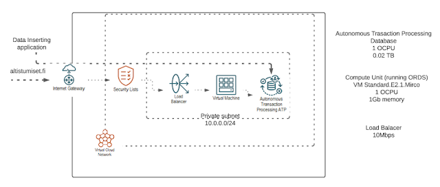
After the first version of the application went live, we made several subsequent improvements. First, we registered a public domain for the exposure application: altistumiset.fi (see Figure 1). We also enhanced the environment by adding a load balancer and configuring the web traffic to go over SSL.
Figure 1. The altistumiset.fi architecture using Oracle Cloud Free Tier (Credit: Sami Lehtinen/Miracle Finland Oy)
We further improved the application based on feedback from both the volunteer team and the end users. We added several maps to the application so it would be easier for end users to understand the exposures situation in Finland. At first, the team was under the impression that adding maps would require some investment. Although we knew that the spatial functionalities (
Oracle Spatial) in the database were free, the team was unaware we could use the map service (
Oracle Maps Cloud Service) from an Oracle APEX application completely free of charge if employed in combination with the maps.oracle.com API and available Oracle APEX plugins.
Oracle informed us about this valuable option, which allowed us to integrate maps into the app without any investment. The map coordinates are stored within the database, and when a user inserts an address, a trigger automatically adds the location information into the table. The map component then uses this data to correctly position the location on a map.
There are two kinds of maps within the application:
◉ location map that shows the exact points of exposures, and
◉ heat map that shows with different colors how each area is doing compared with other areas
Figure 2 illustrates the heat map. The areas experiencing the most cases are shown in red. The map in Figure 2 is based on postal codes, but there is an additional heat map that uses the information on a city level. A simple algorithm decides the coordinates for each case. Declarative attributes in Oracle APEX define the location of the map service, the default zoom level, and the default center point of the map (so that it will show only Finland). Likewise, the application uses declarative attributes for the copyright text in all maps and charts in order to comply with the terms of use of the underlying service
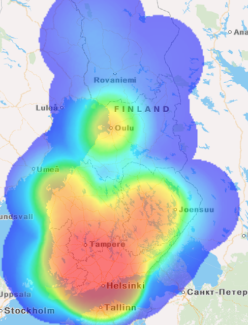
Figure 2. Exposure heat maps show with different colors how each area is doing compared with other areas.
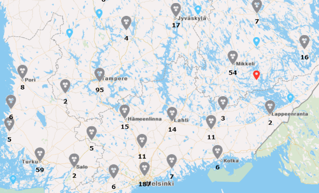
The location map shows the exact location of an exposure and the number of exposures in the area (see Figure 3). If a user clicks on the map closer to the location, the map shows the exact place either as a red pointer (an event that happened during the past seven days) or as a light blue pointer (an event that happened more than seven days ago). If a user clicks a pointer in a map, the app displays a more detailed description of the exposure event. Creating the heat maps and location maps was straightforward, because Oracle’s maps plugins hid much of the complexity. The new native maps support in Oracle APEX 21.1 would have made it even simpler, but this release was not available at the time.
Figure 3. The location map shows exact locations of exposures and the number of exposures in the area.
We show the data in other ways as well. Figure 4 shows the application menu. The whole idea started with school exposures, which are shown first in the menu. Next there is the “Were you here?” functionality that shows public places where someone might have been exposed to COVID-19. Total exposures show all exposures in Finland, Analyses includes analyses for the exposure data as well as infections data, and Current situation shows a map of how Finland is doing overall with COVID-19. The app also features Submit a missing exposure event functionality, which allows users to add any event data missing from the system. This manually entered data is checked by the volunteer team, and if accepted, the data is added to the database.
Figure 4. Menu of the altistumiset.fi application.
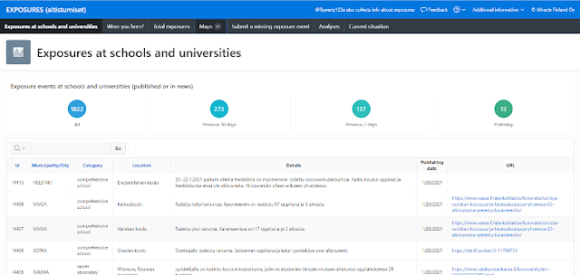
Users have the ability to view some of the data as spreadsheets, with the option of sorting the data or selecting just some of the data based on different criteria. However, the easiest way for the human eye to see the data is via charts and graphs. It is quite easy to show the data in a visual way by using Oracle APEX, and altistumiset.fi uses many of those features. Exposures in schools and universities shows the number of exposures in total (since data collection started) as well as exposures during the previous 30 days, previous 7 days, or previous 1 day (see Figure 5).
Figure 5. Users can sort the Exposures at schools and universities view based on several time periods.
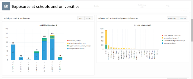
To compare the data, there are several charts from different perspectives. Figure 6, for example, shows the impact of different school levels to exposures and also compares the number of exposure events in different hospital districts.
Figure 6. The Exposures at schools and universities view showing exposures per level of the school or the hospital district.
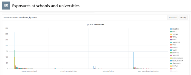
Figure 7 shows the number of exposure events by town. Users can limit the towns displayed by deselecting some of the towns and can flip the chart to display vertically or horizontally.
Figure 7. The Exposures at schools and universities view showing exposure events by town.
Users can also view the distribution of exposure events by type of school in a pie chart (see Figure 8).
Figure 8. The Exposures at schools and universities pie chart sliced by type of school.
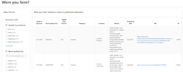
The most useful functionality to the general public has been “Were you here?” This ability enables someone to check whether they have been in a public place that’s experiencing exposures. On this page, users can see where and when an exposure has happened. They can also filter the exposure events by a healthcare district, municipality/city, or categories such as restaurant, shop, hobby, public transport, spiritual event, private event, or daycare/kindergarten.
Figure 9. The Were you here? view allows users to see if they were present in a public place during an exposure event.
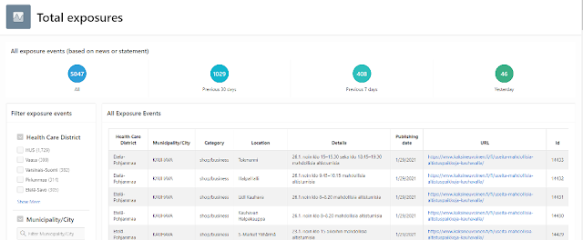
Total exposures (Figure 10) shows all exposures in Finland since the group started to register them. Users can filter the exposure events by a healthcare district, municipality/city, or other category.
Figure 10. The Total exposures view showing all exposures in Finland.
There also are several charts related to total exposures. Figure 11 shows the new cases by category for previous month compared with current month. This allows users to see if the number of exposures has been increasing or decreasing in that category.
Figure 11. The Total exposures view showing new cases per month per category.
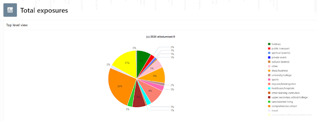
The top-level view (Figure 12) shows how the total exposures have been split to different categories.
Figure 12. The top-level pie chart view of Total exposures, sorted by category
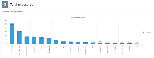
Top-level view as percentages (Figure 13) shows the split into different categories but as a bar chart. The app has a similar chart showing just the data of the past 14 days.
Figure 13. The top-level bar chart view of Total exposures sorted by category.
The Analyses section (Figure 14) offers deeper analyses of the COVID-19 situation in Finland. Currently this information is available only in Finnish, but Oracle APEX provides a full translation infrastructure if the team wishes to provide this in other languages in the future.
Figure 14. The Analyses functionality allows users to perform deeper analyses of the data.
The most recent addition to the application is Current situation, which shows how Finland is doing with COVID-19 today. This data shows in a heat map view where the most exposures have happened over the past 21 days and displays the number of exposure events and infected people for yesterday, past 7 days, past 30 days, and in total (see Figure 15). The source for the number of infected is the
COVID-19 data repository maintained by the Center for Systems Science and Engineering (CSSE) at Johns Hopkins University.
Figure 15. The Current situation view shows exposure events versus infected people over various time periods.
There are also two pie charts (Figures 16 and 17) that show the number of exposures and infections per month so users can compare one month with other months.
Figure 16. The Current situation view showing exposures per month compared with other months.

Figure 17. The Current situation view showing infected people per month compared with other months.
When users enter the application, they must first accept the terms of use. This is also where users can select their preferred language. Currently altistumiset.fi supports two languages: Finnish and English. Every time something is changed within the application definition, the team can retranslate the text by using the built-in Oracle APEX translation facilities to ensure both language versions are updated.
Scalability
On the busiest day recorded, the application had 600,000 distinct users, and the peak period had 300,000 users in a two-hour period, which the application was able to handle quickly. What did cause the team some headache was the disk space. The application stores quite a lot of images for analyses and correctness of the data within the database itself, which requires additional storage. Oracle’s Always Free cloud service has a storage limitation, and the application came very close to hitting that limit. We had started thinking about a possible solution when Oracle offered instead to sponsor the application with a cloud service that provided sufficient resource limits. Figure 15 shows the new architecture.
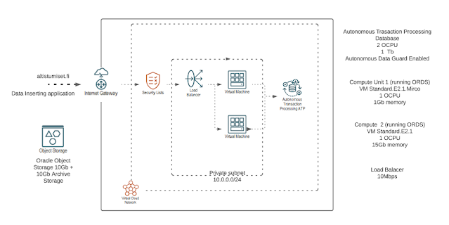
Figure 18. altistumiset.fi’s new architecture with Oracle Object Storage, expanded database with Active Data Guard, and additional Compute to support growing demand (Credit: Sami Lehtinen/Miracle Finland Oy)
A key advantage of using Oracle Cloud and Oracle Autonomous Database has been that both Oracle APEX and the database are maintained and upgraded automatically by Oracle. Furthermore, backups are automatically taken care of and
Oracle Autonomous Data Guard is enabled, which means the database also has a fully managed disaster recovery configuration. The development and test environments are still running on an Oracle Cloud Free Tier, yet the process remains simple: the team performs all application development in the development environment. When an app is ready to be tested, the team moves it to test environment via the Oracle APEX export/import application functionality. If all the tests succeed and the new functionality is verified, the team uses the same process (export/import) and moves the application artifacts to production with no outage and no impact on the end users.
Source: oracle.com






0 comments:
Post a Comment